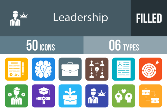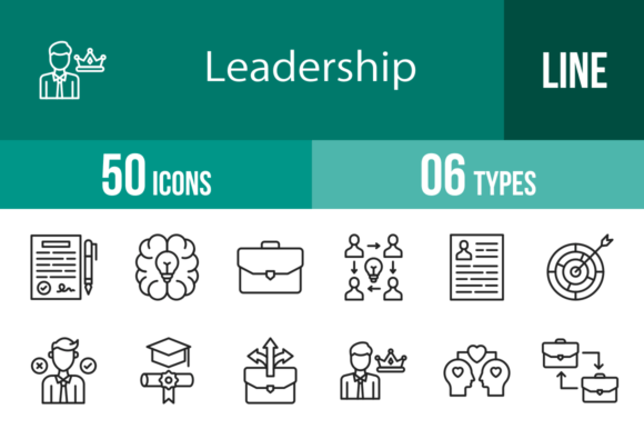
50 Leadership Line Icons: The Versatile Asset for Your Brand
In the fast-paced world of digital design, visual communication is not just a luxury—it is a necessity. Whether you are building a mobile app, designing a corporate presentation, or curating content for a blog, the imagery you choose defines how your audience perceives your brand. This is particularly true when discussing abstract concepts like management, strategy, and growth. This is exactly where the 50 Leadership Line Icons set shines. It is not merely a collection of drawings; it is a comprehensive design toolkit built to convey authority, clarity, and professionalism across every medium.
The Anatomy of the Collection
What makes a design asset truly "premium"? It comes down to the balance between aesthetic appeal and functional utility. This collection of 50 Leadership Line Icons is designed using a strict unigrid system. For the non-designer, this means that every icon—whether it is the Brainstorming lightbulb or the Trophy—sits within the same invisible bounding box. This ensures that when you place them side-by-side in a user interface or a printed brochure, the alignment is perfect. There is no visual jitter or awkward spacing, which is a common problem with lower-quality icon packs.
Visually, these icons embrace a clean, minimalist line art style. They avoid heavy fills in favor of distinct outlines, allowing them to integrate seamlessly into complex layouts without overwhelming the text. This minimalist approach ensures that the icons complement your typography rather than competing with it. Whether you pair them with a bold serif font for a traditional corporate feel or a sleek sans serif font for a modern tech startup vibe, the icons adapt to their surroundings.
Real-World Applications: Where Strategy Meets Style
The true value of the 50 Leadership Line Icons lies in their versatility. As a designer or entrepreneur, you need assets that can pivot between projects. Here is how you can leverage this set across different industries:
- Mobile App and Web Design: In UI/UX design, clarity is king. Use icons like Navigation, Search, or Menu to replace text labels. The Support and Question icons are perfect for help centers, while Time Management and Focus are essential for productivity apps. Because they are 100% vector icons, they scale perfectly on high-resolution retina displays without pixelation.
- Corporate Presentations and Pitch Decks: A slide deck filled with text is a recipe for a disengaged audience. Break up the monotony using icons like Strategy, Growth, and Performance. Visualizing a "growth trajectory" with the Ladder or Target icon helps stakeholders grasp complex data points instantly.
- Brand Identity and Logo Design: While an icon pack is rarely used as a final logo "out of the box," these vectors serve as an incredible starting point for logo design concepts. The Leader, Rudder, and Torch icons carry strong symbolic weight. A designer can extract elements from these icons to create a unique mark that represents guidance and vision.
- Editorial and Publishing: For bloggers and content creators, visual hierarchy is crucial for readability. Use the Skills, Brainstorming, or Collaborate icons as bullet points or section dividers. This adds a professional polish to your articles that standard stock photography cannot match.
Technical Superiority and Usability
One of the standout features of this set is the sheer breadth of file formats included: AI, CDR, EPS, JPG, PNG, and SVG. This is critical for workflow efficiency. If you are a crafter working on a physical product, the high-resolution PNG files are ready to go. If you are a web developer needing lightweight, scalable graphics, the SVG files are optimized for code.
The inclusion of 20 different PNG sizes is a thoughtful touch that saves hours of resizing work. From tiny 16x16 pixel favicons to large 512x512 pixel feature images, you have the right resolution for every context. This attention to detail ensures that the 50 Leadership Line Icons maintain their visual integrity whether they are viewed on a smartwatch or a 4K monitor.
Furthermore, the icons are fully editable. Because they are vector-based, you can change the stroke weight to match your brand’s visual identity. Need a heavier line to match a bold display font? You can do that in seconds. Need to change the color to match your specific hex code for your brand identity? It is a one-click process.
Enhancing Visual Hierarchy and Engagement
In marketing, we often talk about "visual weight." A page that is text-heavy feels dense and uninviting. By integrating the 50 Leadership Line Icons, you create breathing room in your design. The icons act as visual anchors that guide the reader’s eye down the page.
Consider the concept of Visual Hierarchy. By placing a Key icon next to a "Key Takeaways" section, or a Medal icon next to a "Top Achievements" list, you are using modern typography principles to signal importance. This is not just about decoration; it is about improving the user experience and ensuring your message is absorbed.
For social media graphics, where attention spans are measured in milliseconds, these icons are invaluable. A bold statement about Integrity or Influence paired with the corresponding icon creates a stop-scrolling effect. It adds a layer of professionalism that distinguishes your content from amateur competitors.
Choosing the Right Icon for the Right Moment
With 50 options, it can be tempting to use them all at once. However, restraint is the hallmark of good design. When selecting from the 50 Leadership Line Icons, consider the specific emotion or concept you need to convey:
- For Decision Making and Strategy: Look to Dart Board, Rudder, and Chess (if applicable, otherwise Strategy). These convey control and foresight.
- For Team Dynamics: Agreement, Handshake, Teamwork, and Exchange are perfect for HR materials, company culture decks, and collaborative project management tools.
- For Achievement and Success: Trophy, Medal, Diploma, and Success are universal symbols of victory. Use them for reward systems, gamification elements, or celebrating milestones.
- For Personal Growth: Ladder, Growth, Torch, and Vision work well for coaching websites, motivational content, and educational platforms.
Practical Tips for Implementation
To get the most out of this premium font alternative asset, keep these practical tips in mind:
- Consistency is Key: If you use the Leader icon with a specific color and stroke width, ensure the Followers or Teamwork icon matches exactly. Consistency builds trust.
- Color Psychology: While the default is likely black or grey, use color to reinforce meaning. Use green for Growth and Positive Thinking, or blue for Integrity and Trust.
- Negative Space: Don’t crowd the icons. Line art relies on negative space to be legible. Give them room to breathe, especially at smaller sizes like 16x16 or 24x24.
Ultimately, the 50 Leadership Line Icons are more than just design assets; they are communication tools. They bridge the gap between complex leadership concepts and instant visual recognition. Whether you are a small business owner building your first website or a seasoned publisher refining your visual language, this collection provides the versatility and quality needed to elevate your work.